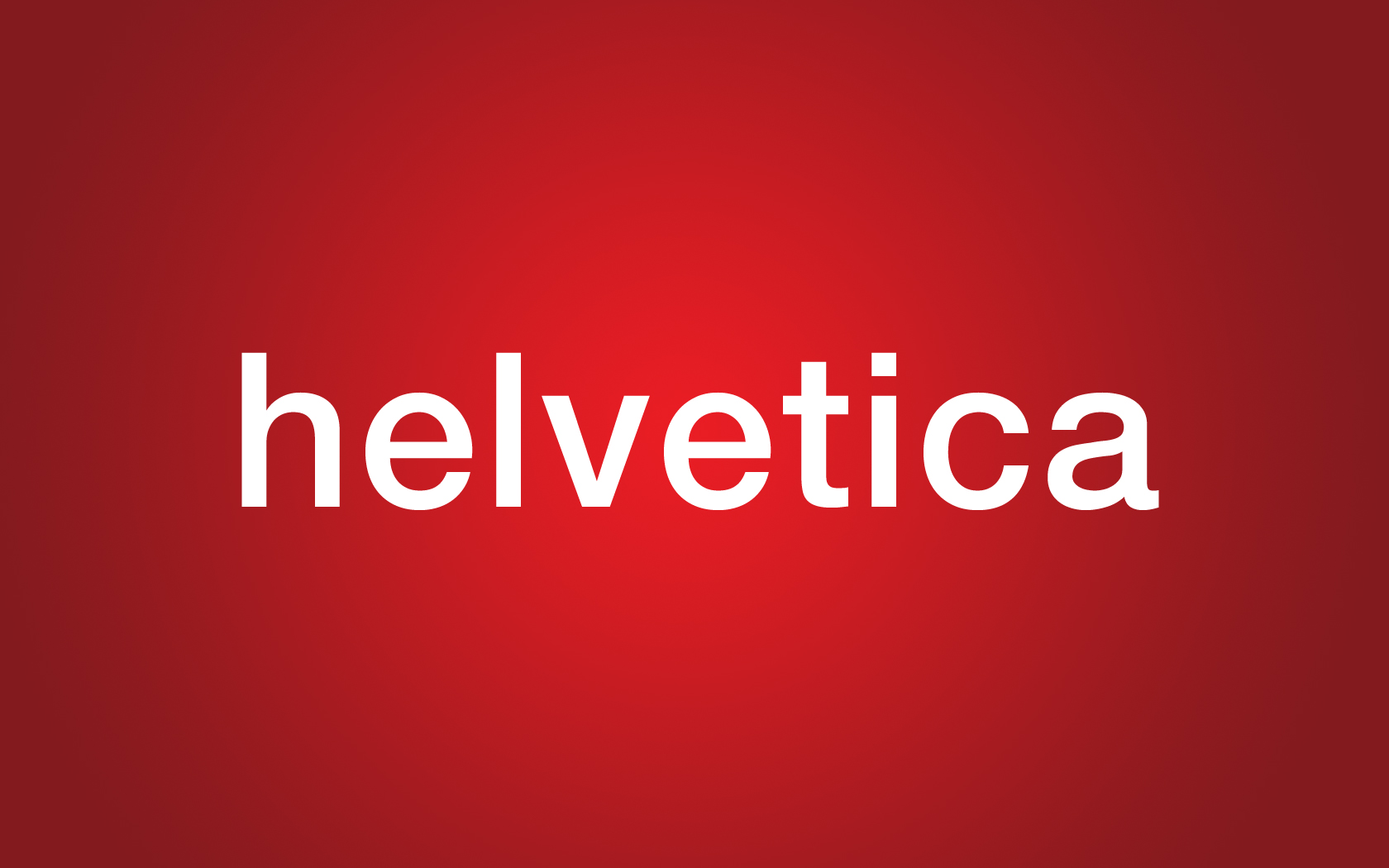
I was able to view the 2007 documentary “Helvetica”, which outlined typography and visual culture throughout a number of years. The video was based around the typeface Helvetica (“Helvetica” meaning “The Swiss Typeface”), a sans-serif font, developed in 1957, conceived by Eduard Hoffman and executed by Max Miedinger. The aim of this typeface design was to create a clear, easy-to-read, neutral font.
Helvetica became a nice break from popular fonts seen during this time period, which were usually overly expressive and difficult to read. Alfred Hoffman, son to Helvetica creator Eduard Hoffman, explained in this documentary that type doesn’t need to be expressive; it needs to be clear and neutral. A sudden change from the over-used, overly decorative fonts, perhaps this is why Helvetica became so popular. It became the new hit; being frequently used on shop logos, posters, signs, TV show posters, CD covers and even tax forms in an attempt to make them seem more wholesome. In fact, Helvetica was then said to make logos appear professional, efficient and clear – and was widely used because of this.
Many designers attempted to copy or improve this font, though found it difficult to do so, as it was already so well constructed and distinctive in itself. Fonts such as Arial and Microsoft Sans Serif, for example, contain similarities to the Helvetica font.

Because this font was being so frequently used in Graphic Design, Helvetica then gradually became dull for modern day designers to use and view. The font was routine, boring. Designers wanted a change, wanted to produce something with vitality instead. David Carson, a well-known typographic designer, explains in the documentary, “Just because something is legible doesn’t mean it communicates” and that, “There is a very thin line between simple, clean and powerful and simple, clean and boring”. To many Helvetica appeared to have crossed that line.

However, Helvetica is still regarded as a design-changing font and is still often used in advertisements to this day. Examples include American Airline, the iPod, Microsoft, Jeep and many informative signs.

For the next few days I looked around me for any signs of Helvetica and found it everywhere: on directional signs, on shop bags, on the button for traffic lights, on various websites, on town signs, in magazines, on DVD's, even on my Dry Shampoo bottle and my iPod.
No comments:
Post a Comment